Skip to content

bigfunctions > chart

chart

Call or Deploy chart ?

✅ You can call this chart bigfunction directly from your Google Cloud Project (no install required).

  • This chart function is deployed in bigfunctions GCP project in 39 datasets for all of the 39 BigQuery regions. You need to use the dataset in the same region as your datasets (otherwise you may have a function not found error).
  • Function is public, so it can be called by anyone. Just copy / paste examples below in your BigQuery console. It just works!
  • You may prefer to deploy the BigFunction in your own project if you want to build and manage your own catalog of functions. This is particularly useful if you want to create private functions (for example calling your internal APIs). Discover the framework

Public BigFunctions Datasets:

Region Dataset
eu bigfunctions.eu
us bigfunctions.us
europe-west1 bigfunctions.europe_west1
asia-east1 bigfunctions.asia_east1
... ...

Description

Signature

chart(data, chart_type, ylabel)

Description

Return html with a chartjs chart

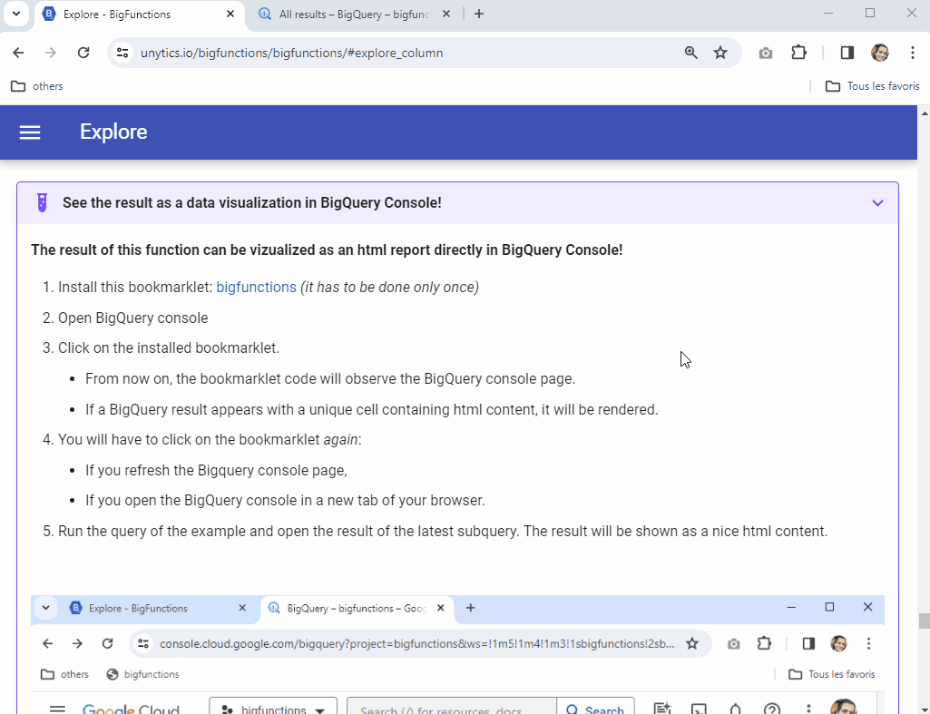
See the result as a data visualization in BigQuery Console!

The result of this function can be vizualized as an html report directly in BigQuery Console!

  1. Install this bookmarklet: bigfunctions (it has to be done only once)
  2. Open BigQuery console
  3. Click on the installed bookmarklet.
    • From now on, the bookmarklet code will observe the BigQuery console page.
    • If a BigQuery result appears with a unique cell containing html content, it will be rendered.
  4. You will have to click on the bookmarklet again:
    • If you refresh the Bigquery console page,
    • If you open the BigQuery console in a new tab of your browser.
  5. Run the query of the example and open the result of the latest subquery. The result will be shown as a nice html content.


bookmarklet usage

Examples

select bigfunctions.eu.chart([('2022-08-01', 10000.), ('2022-08-02', 20000.), ('2022-08-03', 40000.), ('2022-08-04', 80000.)], 'bar', 'sales')
select bigfunctions.us.chart([('2022-08-01', 10000.), ('2022-08-02', 20000.), ('2022-08-03', 40000.), ('2022-08-04', 80000.)], 'bar', 'sales')
select bigfunctions.europe_west1.chart([('2022-08-01', 10000.), ('2022-08-02', 20000.), ('2022-08-03', 40000.), ('2022-08-04', 80000.)], 'bar', 'sales')

screenshot

Need help using chart?

The community can help! Engage the conversation on Slack

For professional suppport, don't hesitate to chat with us.

Found a bug using chart?

If the function does not work as expected, please

  • report a bug so that it can be improved.
  • or open the discussion with the community on Slack.

For professional suppport, don't hesitate to chat with us.

Use cases

The chart BigQuery function generates HTML containing a Chart.js chart. Here are a few use cases:

  • Quick Data Visualization within BigQuery: Imagine you're analyzing sales data in BigQuery. Instead of exporting the data to another tool for visualization, you can use chart to generate a bar chart directly within the BigQuery console. This is useful for quick exploratory data analysis and for sharing insights with colleagues directly in the query results.

  • Automated Reporting: You could incorporate the chart function into a scheduled query that generates regular reports. The output HTML, containing the chart, could then be embedded into an email or a web page. This automates the process of creating visual reports, saving you time and effort.

  • Dashboard Components: The HTML generated by chart can be used as a building block for more complex dashboards. You could combine multiple charts generated by the function, along with other data and text, to create a comprehensive overview of your data.

  • Data Quality Checks: You can use chart to quickly visualize data distributions or anomalies. For example, you could create a histogram of a particular metric to identify potential outliers or unexpected patterns.

  • Interactive Data Exploration: While the basic chart function generates static charts, the HTML output could be further processed to add interactivity using JavaScript libraries. This could enable users to drill down into the data, filter the chart, or explore different views.

Concrete Example:

Let's say you have a table called website_traffic with columns date and visits. You want to visualize the trend of website visits over the last week. You could use the following query:

SELECT bigfunctions.us.chart(
    ARRAY_AGG(STRUCT(CAST(date AS STRING), visits)),  -- Prepare data for the chart function
    'line',                                         -- Specify chart type
    'Website Visits'                                  -- Y-axis label
)
FROM `your_project.your_dataset.website_traffic`
WHERE date BETWEEN DATE_SUB(CURRENT_DATE(), INTERVAL 7 DAY) AND CURRENT_DATE()

This query would return HTML containing a line chart showing the trend of website visits over the last week, directly in the BigQuery console. You could then use the bookmarklet mentioned in the documentation to render the chart visually.

Spread the word

BigFunctions is fully open-source. Help make it a success by spreading the word!

Share on Add a on